Composition in photography refers to the arrangement of elements within a frame to create a visually pleasing and effective image. It plays a crucial role in conveying the photographer's message, evoking emotions, and directing the viewer's attention. Good composition helps to simplify a complex scene, highlight important subjects, and create a strong sense of balance, unity, and visual interest. It is one of the most essential elements of good photography and can greatly enhance the impact and effectiveness of a photograph.
The first comprehensive written theories on composition in photography are widely attributed to Henry Peach Robinson and Francis Bacon, both of whom wrote about the subject in the late 19th century. However, the principles of composition have been used by artists and visual storytellers for centuries and have been adapted for use in photography as the medium evolved. Since then, many other photographers and writers have contributed to the development of composition theory, adding their own insights and techniques to create a rich body of knowledge that continues to shape the way photographers think about and approach composition.
The "rules of composition" in photography refer to guidelines that photographers can use to create well-composed images. These rules are not strict rules but rather suggestions that can be used to improve the balance, harmony, and visual impact of a photograph. Some of the most commonly cited rules of composition include:
- The Rule of Thirds: Dividing the frame into thirds both horizontally and vertically, and placing important elements along those lines or at their intersections.
- Leading Lines: Using lines in the scene to lead the eye into and through the image.
- Balance: Achieving balance by arranging elements within the frame in a way that feels harmonious and stable.
- Simplicity: Simplifying the scene by removing distracting elements and focusing on the most important elements.
- Depth: Creating a sense of depth by including foreground, middle-ground, and background elements.
- Contrast: Using contrasting elements, such as color or light and dark, to draw the eye and create visual interest.
These are just a few examples of the many rules of composition that photographers can use to guide their creative process. It's important to remember that these rules are not strict and can be broken if doing so helps to create a stronger, more effective image. Ultimately, the goal of composition is to create a visually pleasing and impactful image, and any guidelines or rules should be used as tools to achieve that goal.
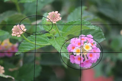
Rule of Thirds:
 |
| Copyright image by Jeffrey Scism |
Here is an example of the use of the Rule of Thirds. As you can see, the main subject of the image is located at the intersection of the right and lower lines. Your subject could be at either of the four intersections or on any of the lines, either horizontal or vertical.
Leading Lines:
 |
| Leading Lines image by Thomas Leuthard - Street Photography |
In this image by Thomas Leuthard, our view is drawn into the image by the converging lines from foreground to the subject. This technique can be very powerful and creat strong images that seem to grab our attention. They rely on minimising distracting parts of the scene, either by creative use of lighting or by changing our point of view when shooting the image. We can also selectively crop an image later in editing or make use of a vignette to achieve a similar effect.
Balance:
 |
| Ingleton Waterfalls Walk Copyright © Steven Dale 2023 |
Balance in an image is a very personal thing. The subject may be very simple (such as an apple on a table with no other elements in the scene) or just feel balanced because each of the seperate elements in the scene just work well together. Personally (I am biased of course!) I feel the image above is an example of the latter. The key is to experiment as always, trying different viewpoints, lenses, times of day and even switching from colout to balck and white.
Simplicity:
 |
| Foxglove - Copyright © Steven Dale 2023 |
Simplicity in an image means that there is really only one key element. In the case above it is the flower that is the key element. It could be a face, a still life, part of a landscape, a building. As always, what makes a truly simple image is personal to the viewer and they may not always agree with the photographer! That is what makes photography so interesting.
Depth:
 |
| Example of depth in an image - Copyright © Steven Dale 2023 |
Depth in an image traditionally means there are elements in the foreground, mid-ground and distance. This creates depth in an image, even though in reality we are looking at flat image. It's not 3-D after all! Usually this will require a wide-angle lens though the use of image stacking can achieve images that are sharp throughout. This is a difficult technique to master and requires time to perfect so is not suitable for every occassion. In most case the use of a wide-angle lens (between 24mm and 35mm will suffice in most conditions) and getting a bit closer to the ground will be best in most situations. A tripod may be needed depending on lighting conditions and the technology within your camera. Check out this article on the Imaging Resource website.
Contrast:
 |
| Contrast using colour in an image - Copyright © Steven Dale 2023 |

Post a Comment
Please leave your comments. I reserve the right to delete racist, abusive, pornographic and other distasteful posts without warning.